Fragrance Flanker Designed for Betsey Johnson
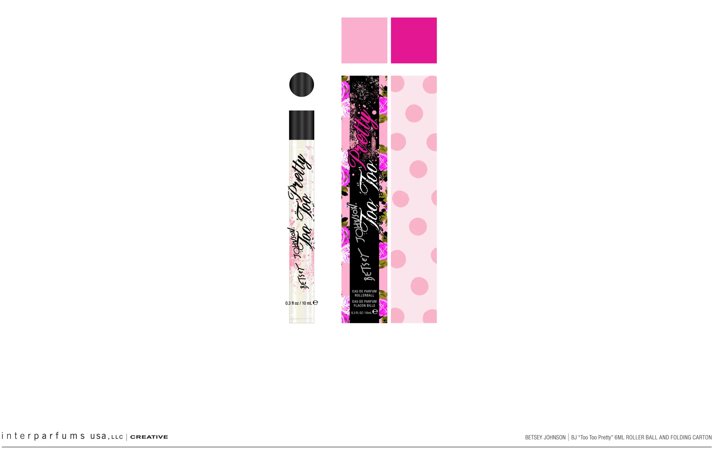
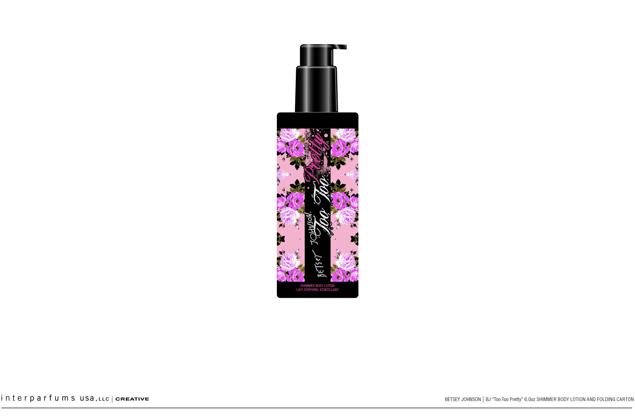
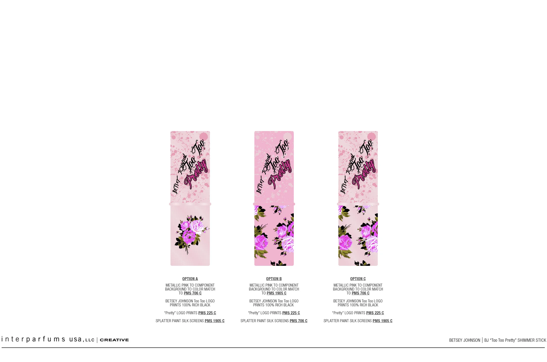
The packaging concept for BETSEY JOHNSON Too Too Pretty was created as the softer, more romantic expression of the original Too Too fragrance. Where Too Too embraces Betsey’s playful punk attitude, Too Too Pretty reveals her more feminine, delicate, and flirtatious side.
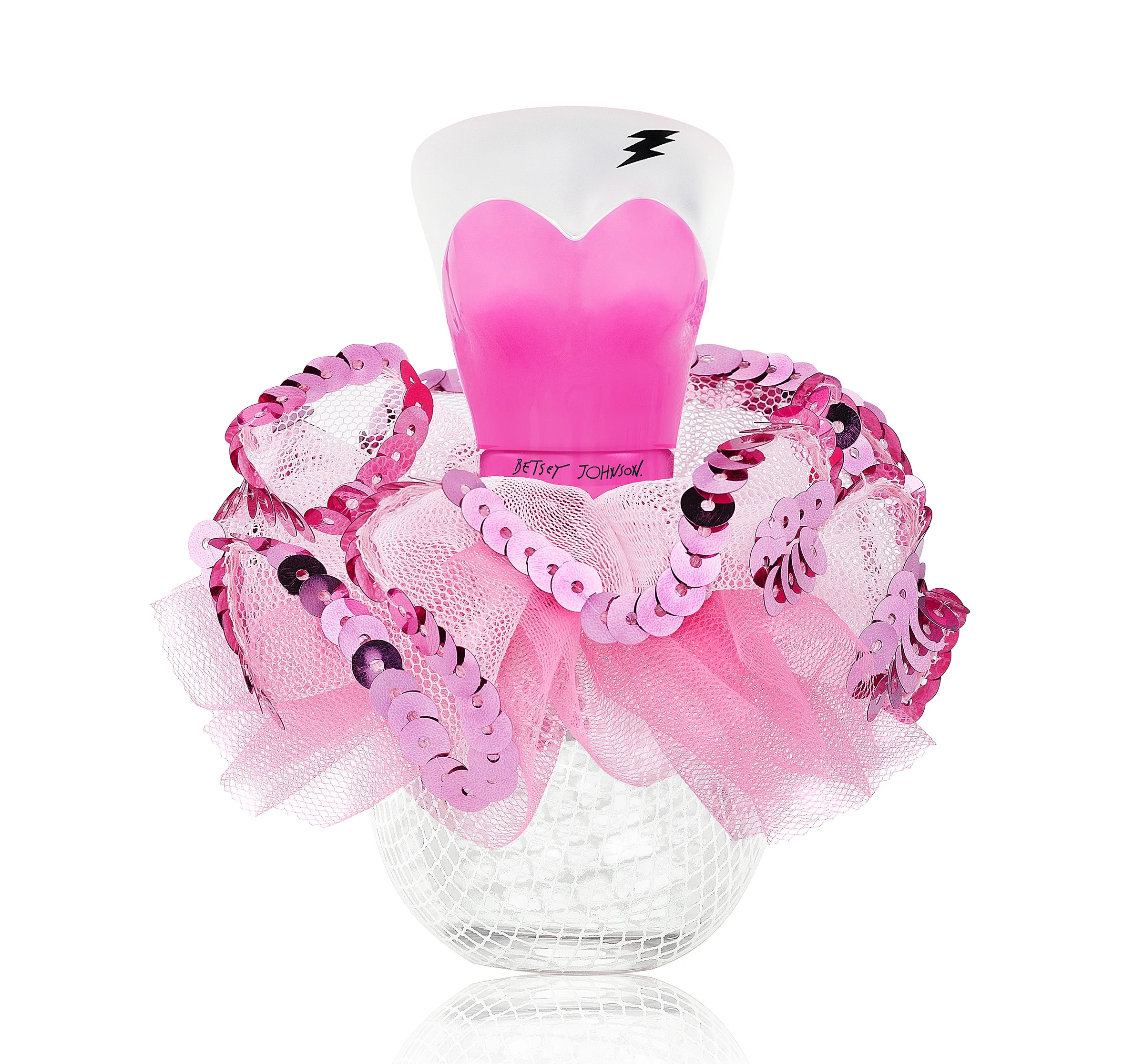
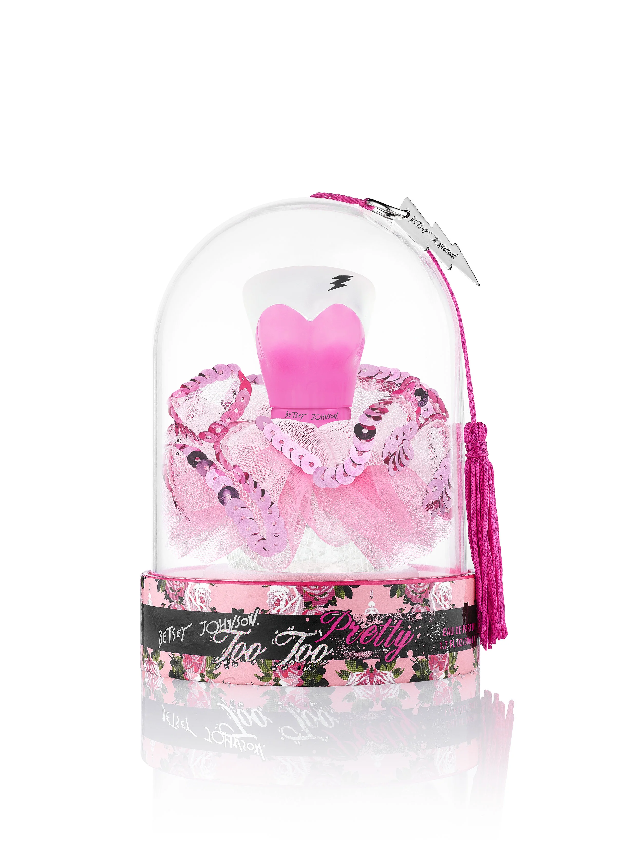
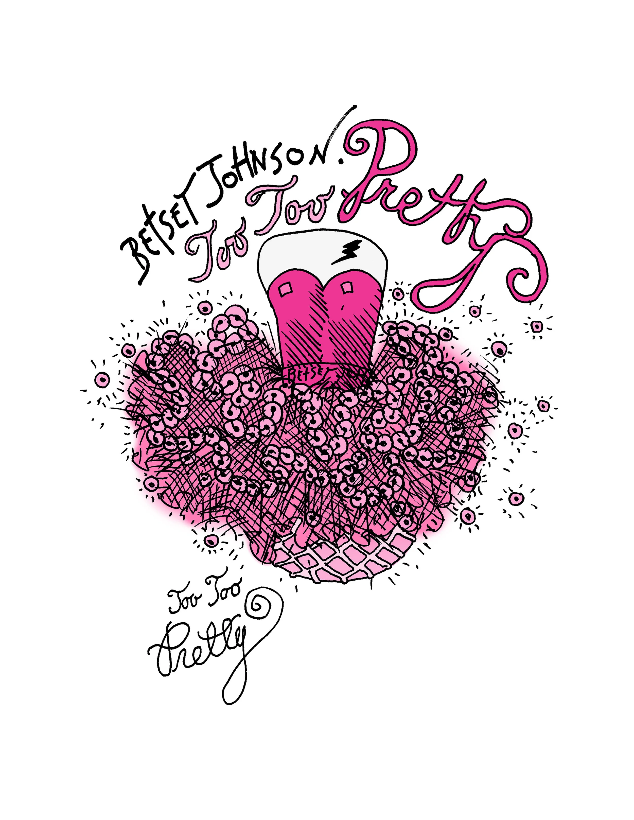
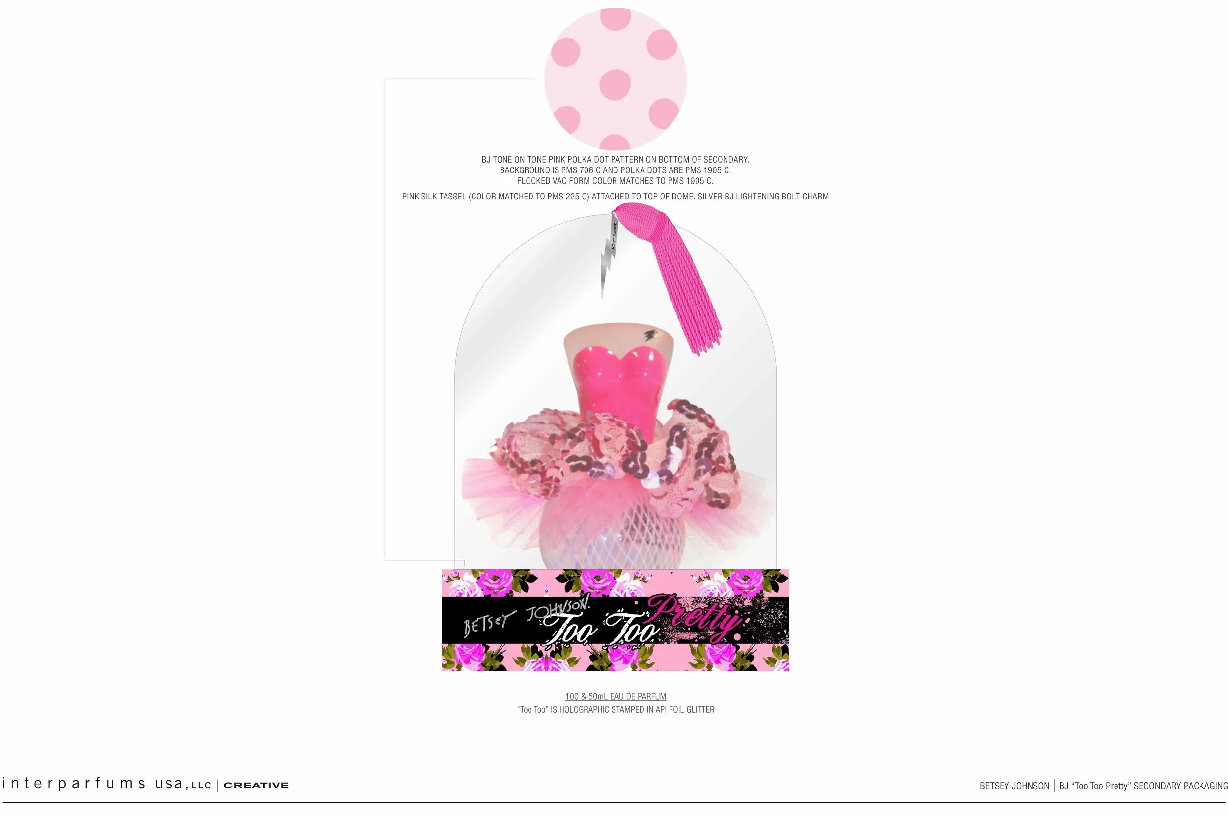
Inspired by the graceful silhouette of a tutu, the design transforms the fragrance bottle into a whimsical confection of pink tulle, delicate fishnet, lace, and shimmering sequins. Layers of soft pink fabric create a sense of movement and volume, almost like a ballerina’s skirt brought to life around the bottle.
The signature heart-shaped bottle reinforces the romantic spirit of the fragrance, while the playful lightning bolt and exaggerated detailing keep the design firmly rooted in the Betsey Johnson world.
The concept celebrates the contrast between softness and attitude — pretty but never precious, feminine but never conventional. It captures the woman who can embrace her romantic side while still maintaining her individuality and rebellious spirit.
Too Too Pretty is the softer side of Too Too.
More romantic. More feminine. More delicate.
But still unmistakably Betsey.
While at Interparfums Inc
Launched 2012