HBA BEST PACKAGING DESIGN AWARD 2012
Fragrance Designed for Betsey Johnson
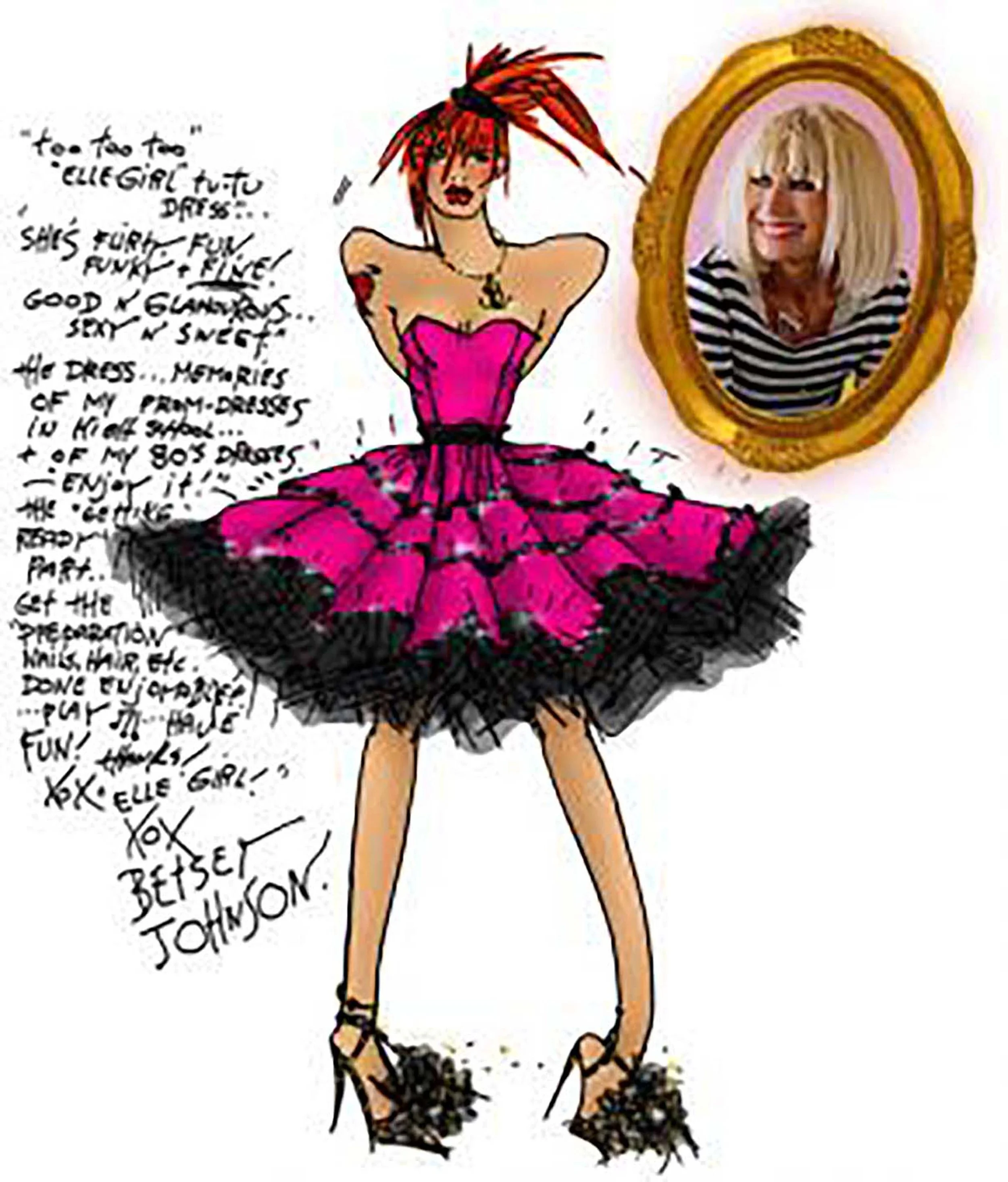
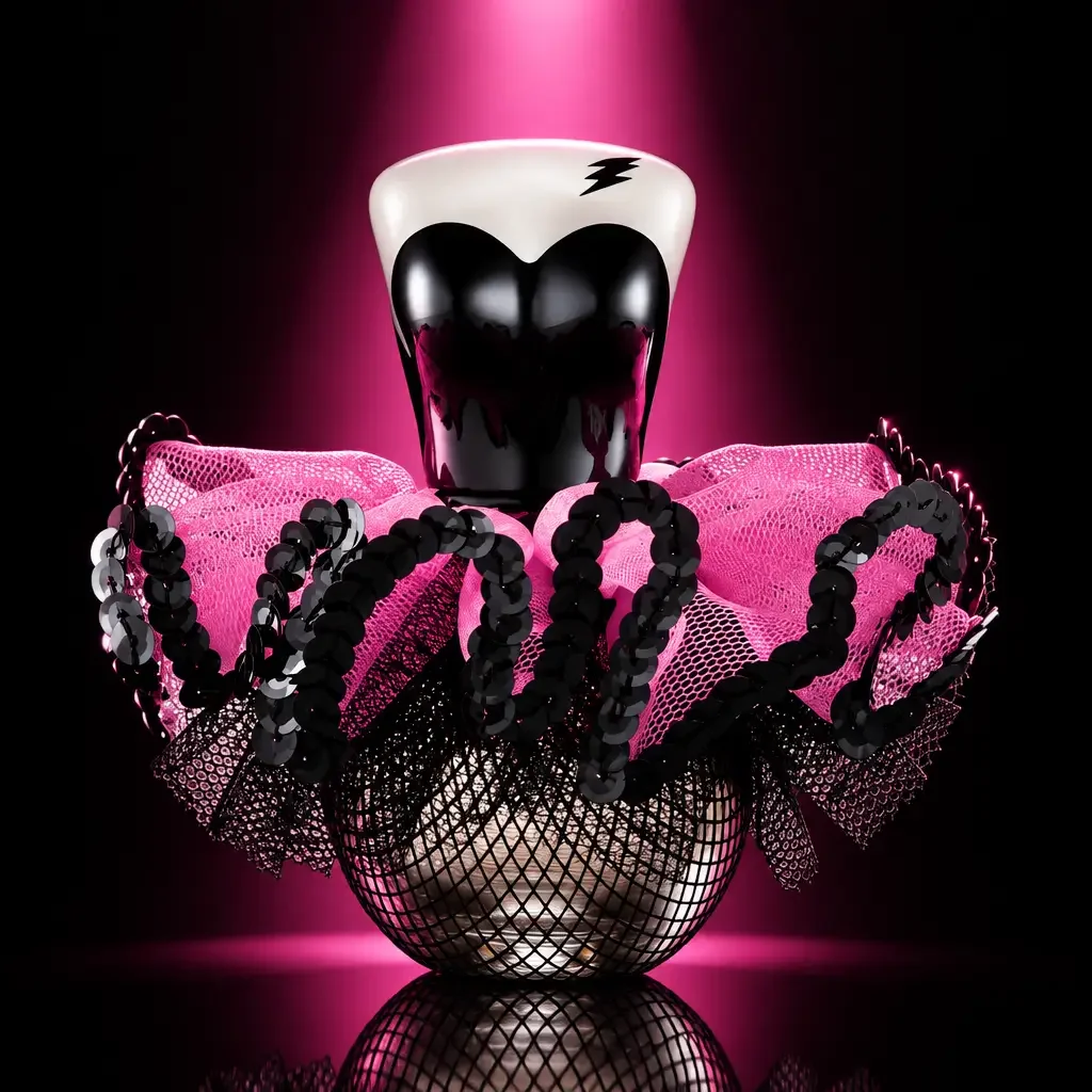
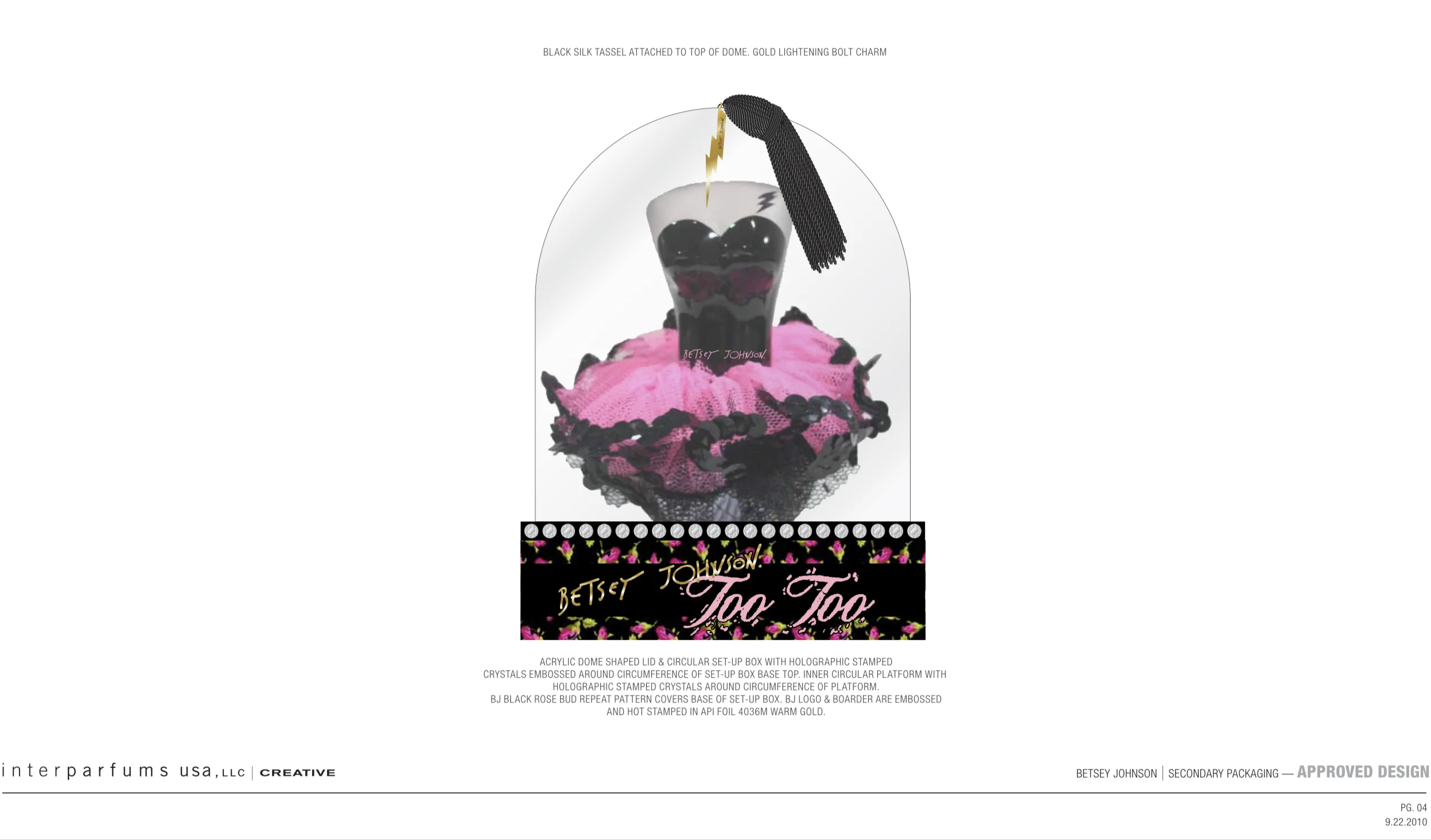
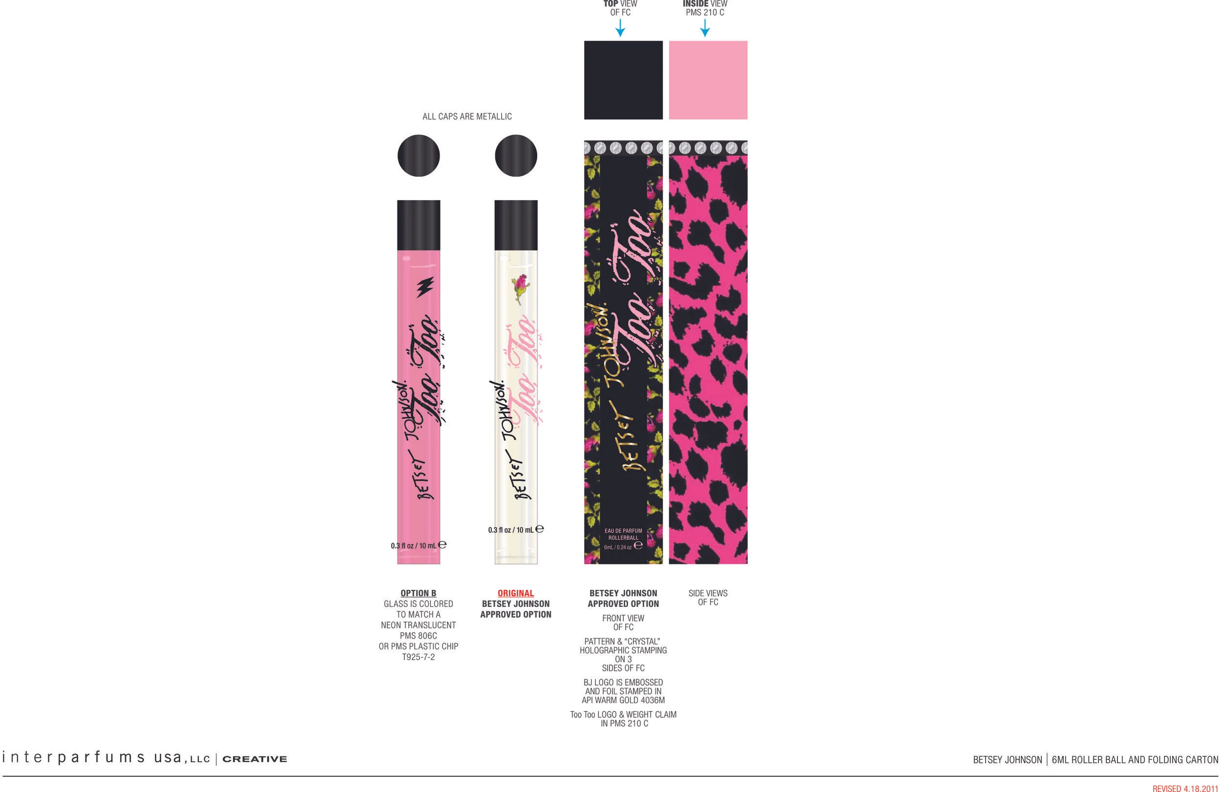
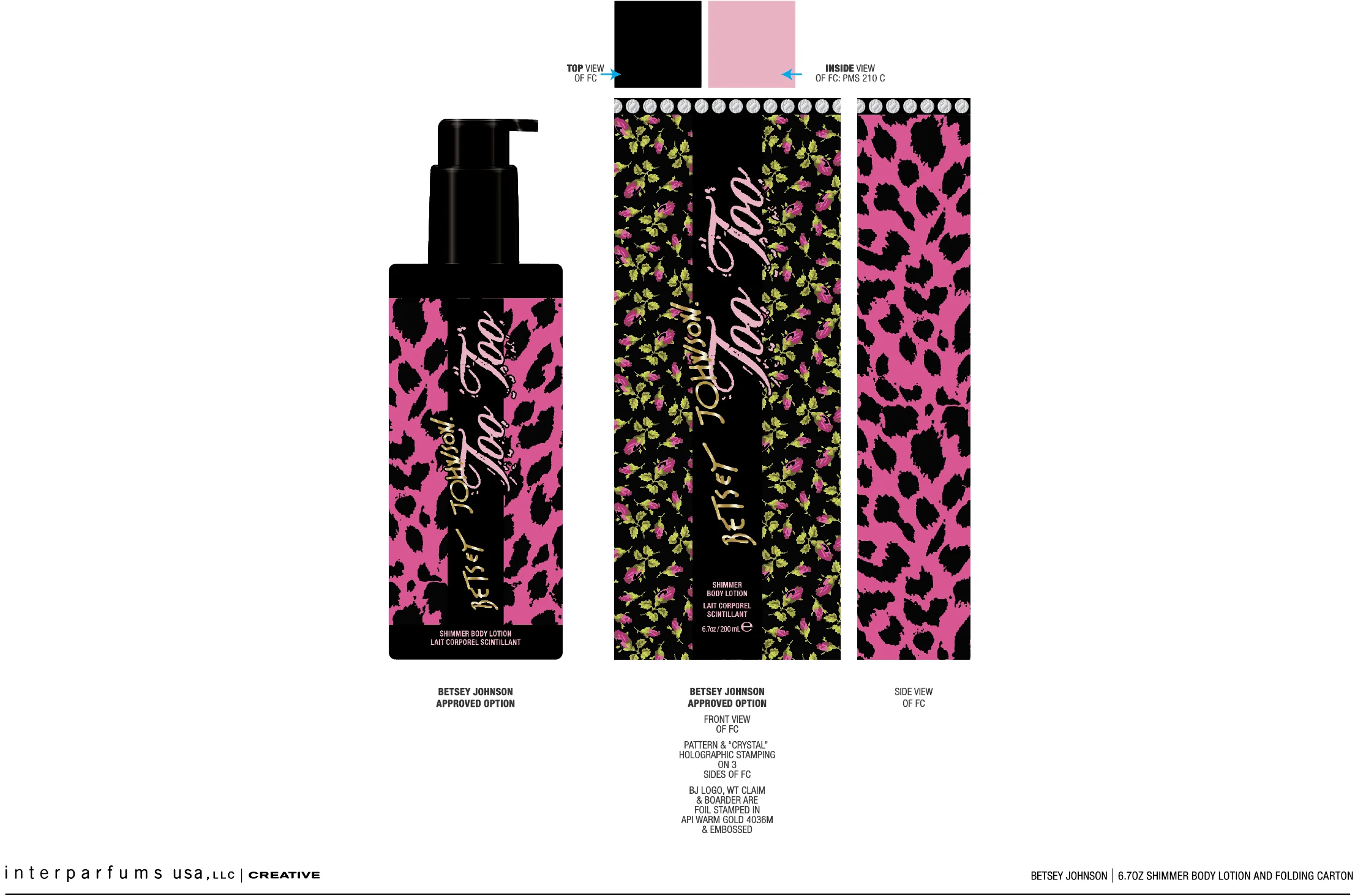
The packaging concept for BETSEY JOHNSON Too Too was inspired by Betsey Johnson’s unmistakable ability to turn girlish fantasy into rebellious fashion. The name itself became the creative springboard: Too Too is a playful nod to the tutu — an iconic symbol of femininity, fantasy, and theatricality — reimagined through Betsey’s irreverent point of view.
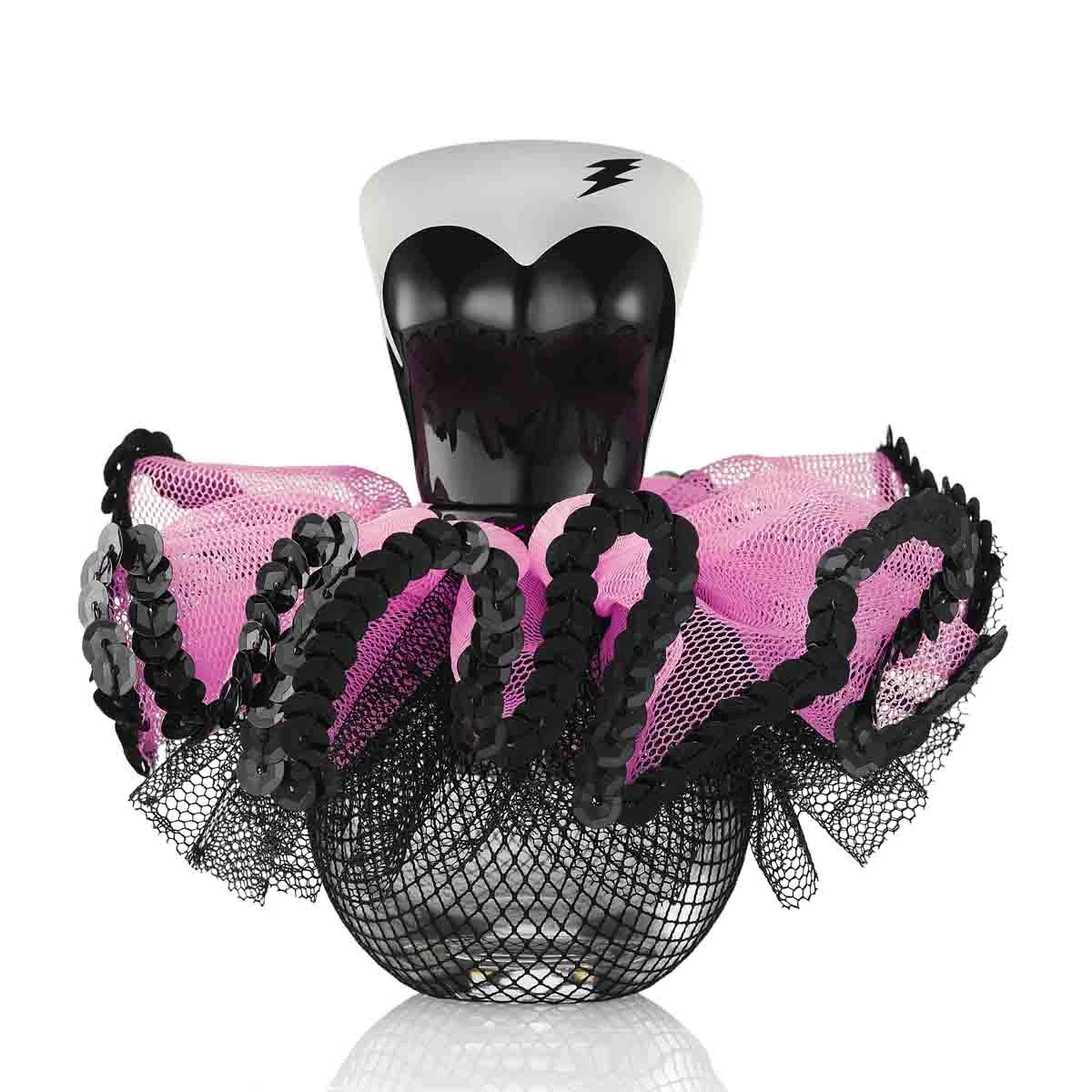
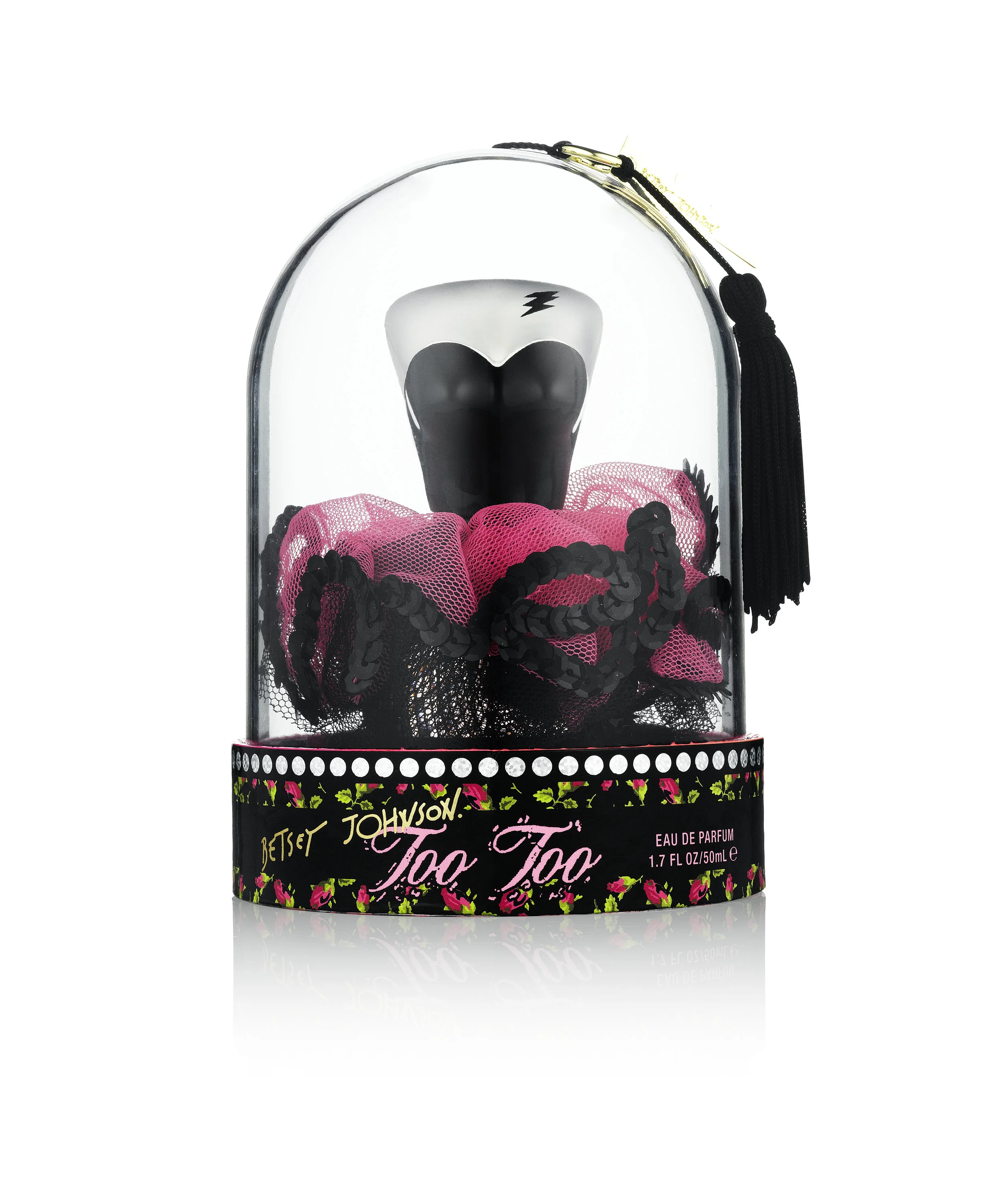
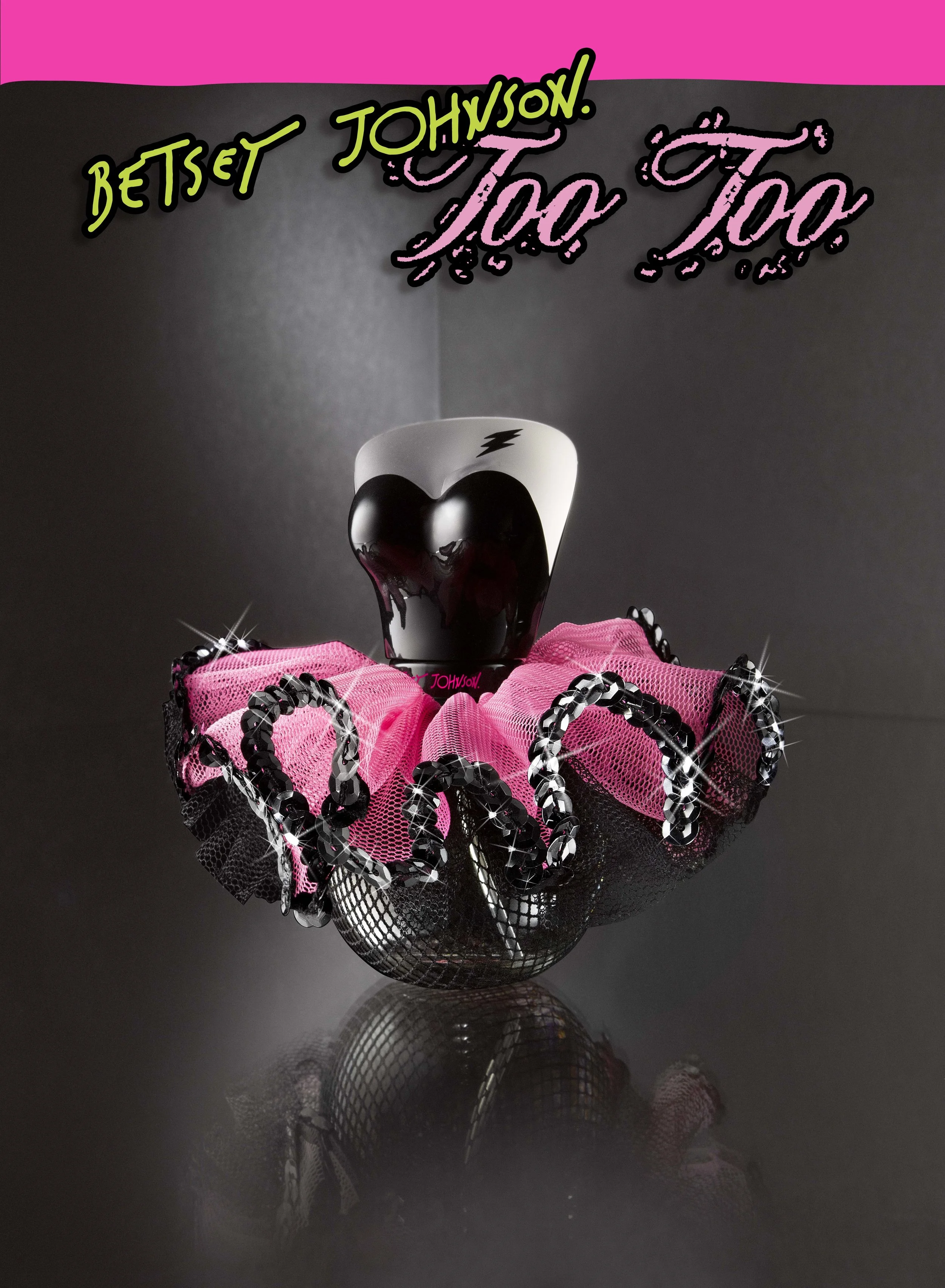
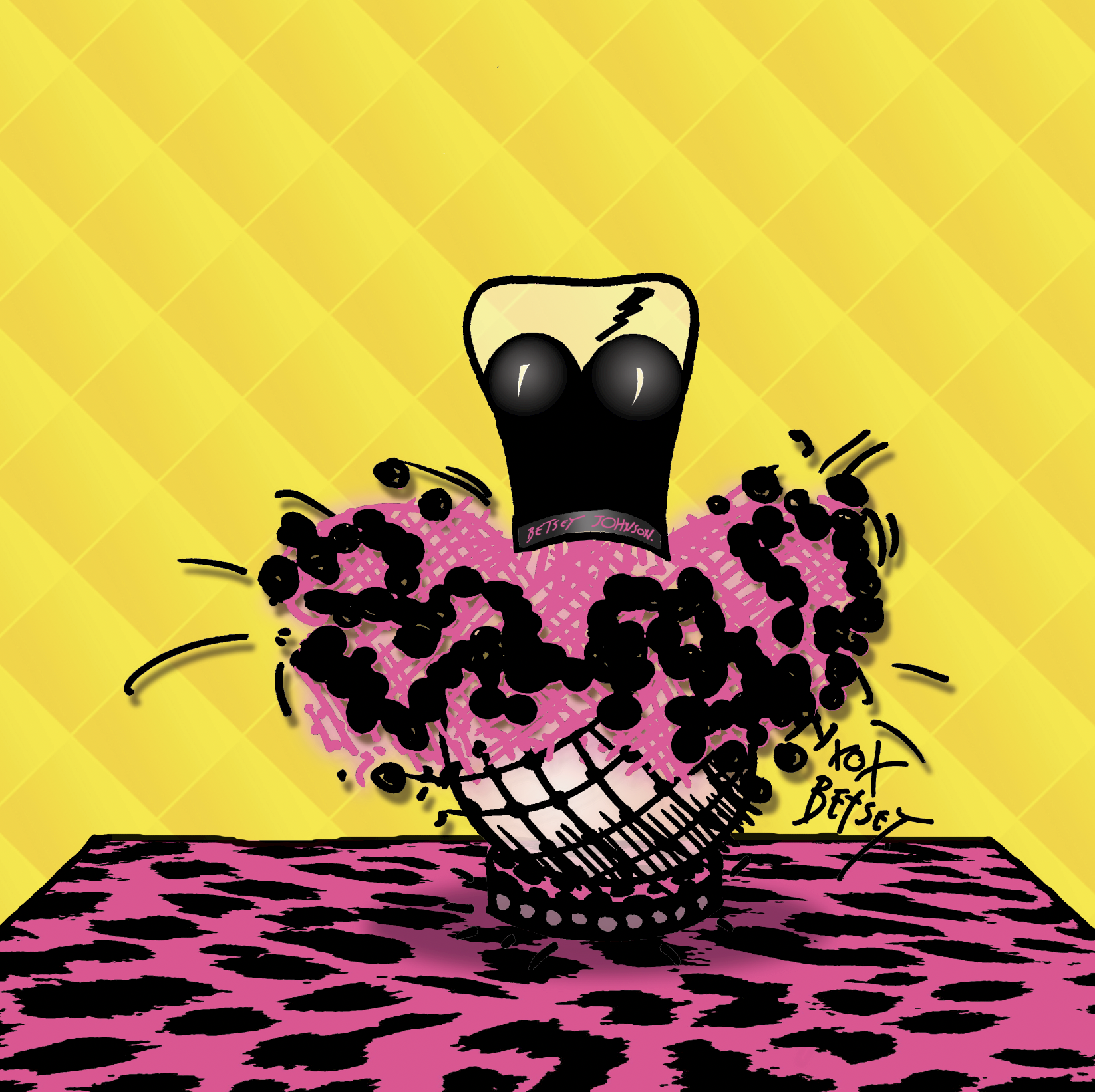
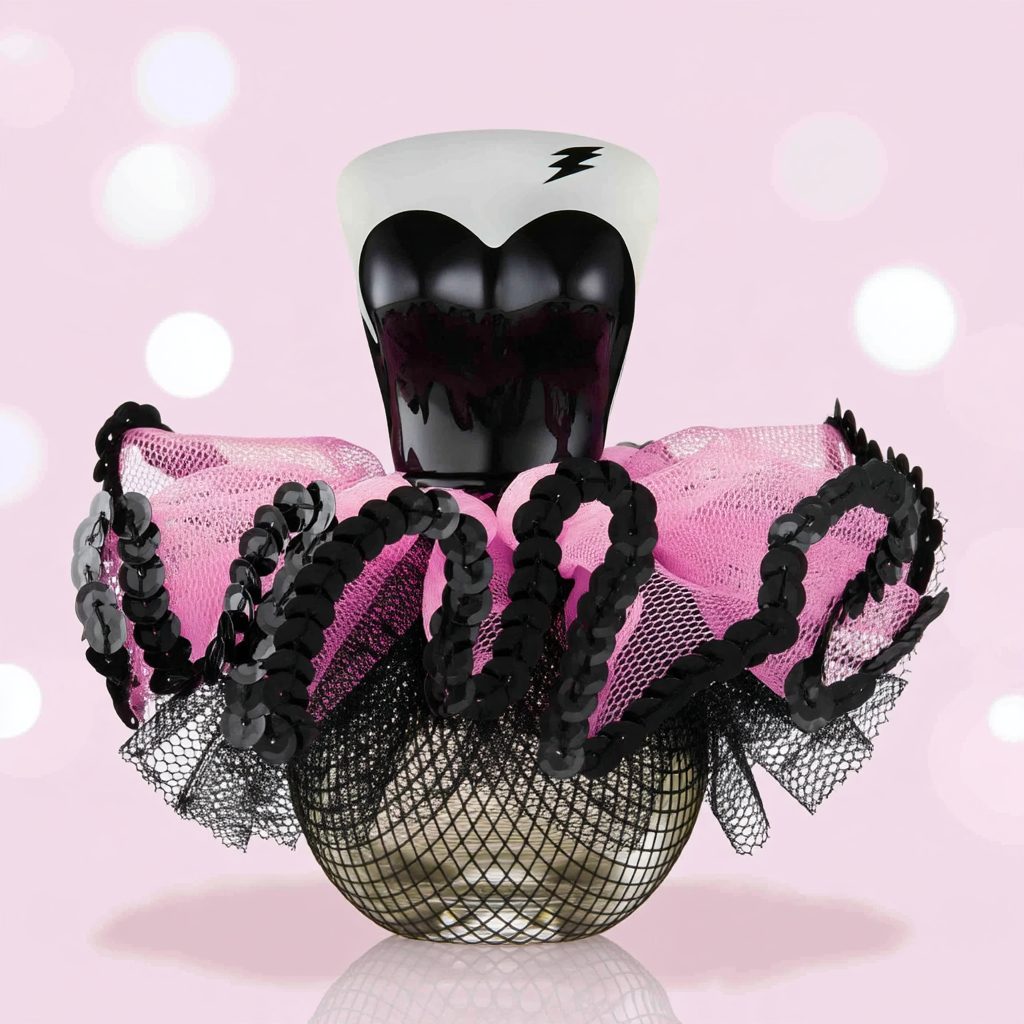
The bottle was conceived as a miniature fashion sculpture, transforming the fragrance into an expression of Betsey’s world. A dramatic heart-shaped silhouette represents her unabashed femininity, while the glossy black finish introduces a darker, punk-inspired edge.
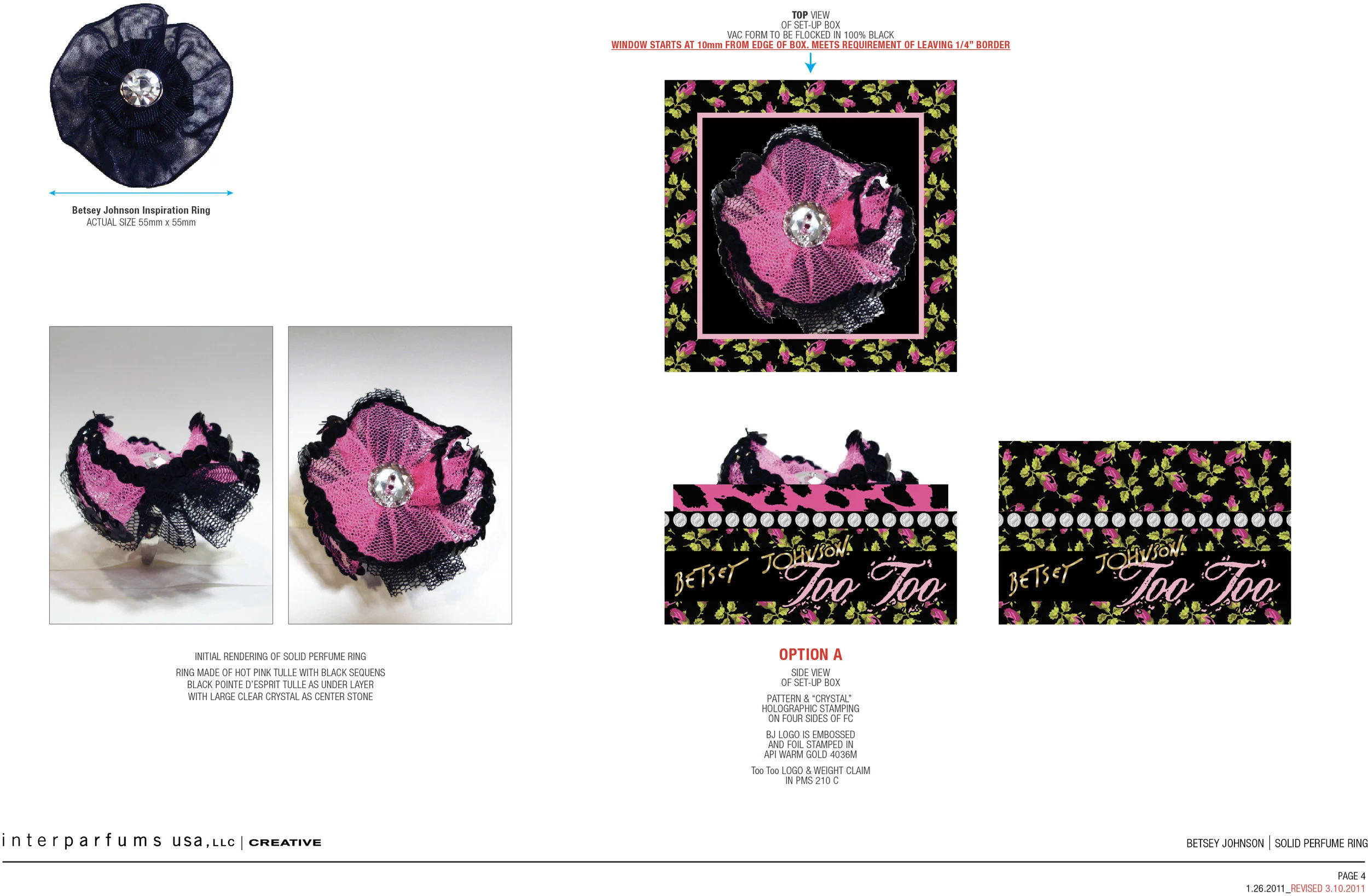
Wrapped around the bottle is an exuberant explosion of hot pink fishnet, black lace, sequins, bows, and layered tulle, creating the visual impression of a rebellious ballerina who has stepped off the stage and into Betsey’s world.
The juxtaposition of materials is intentional: soft versus edgy, innocent versus provocative, ballerina versus punk rocker. The delicate femininity of the tutu is deliberately disrupted by Betsey’s signature attitude, resulting in a fragrance that is anything but conventional.
The bottle was designed to feel like a collectible piece of fashion, capturing the theatricality, humor, and fearless individuality of the Betsey Johnson woman.
Too pretty. Too sexy. Too wild.
Too much — and that's exactly the point.
BETSEY JOHNSON TOO TOO
Too feminine. Too fabulous. Too Betsey.
While at Interparfums Inc
Launched 2011